
Solutions
Sine and cosine
Complete code for this solution looks like:
In [10]:
import numpy as np
import matplotlib.pyplot as plt
# Data to plot
x = np.linspace(-np.pi, np.pi, 700)
y_sin = np.sin(x)
y_cos = np.cos(x)
# NB: We had to introduce a zorder parameter here
plt.plot(x, y_cos, label='sin(x)', color="blue", linewidth=2.5, linestyle="-", zorder=0)
plt.plot(x, y_sin, label='cos(x)', color="red", linewidth=2.5, linestyle="-", zorder=0)
# Set limits
plt.xlim(-np.pi, np.pi)
plt.ylim(-1.1, 1.1)
# Set ticks and labels
plt.xticks([-np.pi, -np.pi/2, 0, np.pi/2, np.pi],
           [r'$-\pi$', r'$-\pi/2$', r'$0$', r'$+\pi/2$', r'$+\pi$'])
plt.yticks([-1, 0, +1],
           [r'$-1$', r'$0$', r'$+1$'])
# Move the spines
ax = plt.gca()  # gca stands for 'get current axis'
ax.spines['right'].set_color('none')
ax.spines['top'].set_color('none')
ax.xaxis.set_ticks_position('bottom')
ax.spines['bottom'].set_position(('data',0))
ax.yaxis.set_ticks_position('left')
ax.spines['left'].set_position(('data',0))
# Annotate the graph
t = 2 * np.pi / 3
plt.plot([t, t], [0, np.cos(t)], color='blue', linewidth=2.5, linestyle="--")
plt.scatter([t, ], [np.cos(t), ], 50, color='blue')
plt.annotate(r'$cos(\frac{2\pi}{3})=-\frac{1}{2}$',
             xy=(t, np.cos(t)), xycoords='data',
             xytext=(-90, -50), textcoords='offset points', fontsize=16,
             arrowprops=dict(arrowstyle="->", connectionstyle="arc3,rad=.2"))
plt.plot([t, t],[0, np.sin(t)], color='red', linewidth=2.5, linestyle="--")
plt.scatter([t, ],[np.sin(t), ], 50, color='red')
plt.annotate(r'$sin(\frac{2\pi}{3})=\frac{\sqrt{3}}{2}$',
             xy=(t, np.sin(t)), xycoords='data',
             xytext=(+30, 0), textcoords='offset points', fontsize=16,
             arrowprops=dict(arrowstyle="->", connectionstyle="arc3,rad=.2"))
# Increase the size of the tick labels in both axes
# and apply semi-transparent background
for label in ax.get_xticklabels() + ax.get_yticklabels():
    label.set_fontsize(12)
    label.set_bbox(dict(facecolor='white', edgecolor='none', pad=0.2, alpha=0.7))
# Set title and legend, then SAVE plot
plt.title('The sine and cosine functions', fontsize=20)
plt.legend(loc='upper left')
plt.xlabel('x', labelpad=-20, x=1.05, fontsize=12)
plt.ylabel('f(x)', labelpad=-20, y=0.7, fontsize=12)
#plt.show()
plt.savefig('./images/cos_sin.png', bbox_inches='tight')

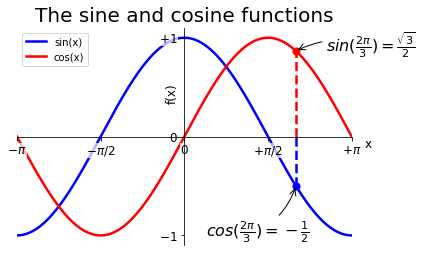
The code also saves the figure:
Customising pandas plots
Full working code for this exercise is
In [11]:
import pandas as pd
import matplotlib.pyplot as plt
# Import the data
csv_file = './data/cetml1659on.dat'
df = pd.read_csv(csv_file, # file name
skiprows=6, # skip header
sep='\s+', # whitespace separated
na_values=['-99.9', '-99.99'] # NaNs
)
# Plot the January and June values
df['JAN'].plot(color='cyan')
df['JUN'].plot(color='orange')
df['YEAR'].plot(color='black', linestyle=':')
# Add a title and axes labels
plt.title('Summer, Winter and average Climate Plots')
plt.xlabel('Year')
plt.ylabel('Temperature ($^\circ$C)')
# Add a legend
plt.legend()
# Find warm winter year point
warm_winter_year = df['JAN'].idxmax()
warm_winter_temp = df['JAN'].max()
# Annotate plot
plt.annotate('A warm winter',
xy=(warm_winter_year, warm_winter_temp),
xytext=(-150, -100), textcoords='offset points', fontsize=14,
arrowprops=dict(arrowstyle="->", connectionstyle="arc3,rad=.2"))
plt.savefig('./images/fancy_summer_climate.png')
# display with 
